

AI Education Companion
Timeline
09/2024 - 12/2024
ROLE
Product Designer
Team
Product Designer x 1
IMPACT
+
%
report completion rate
-
%
less drop-off rate
$
K
investment
PRODUCT VISION
Shellmind aims to empower first-time homeowners to review, question, and approve contractor quotes on their own terms — no industry knowledge required.
It is a consumer AI tool that helps homeowners decode renovation quotes — and make confident decisions without industry expertise.

PRODUCT VISION
To make professional slide creation accessible to everyone by turning AI from a one-click generator into a trustworthy, controllable presentation co-pilot.
DrLambda is an AI slide deck generator that turns text, files, and links into editable, brand-ready presentations — used by educators, students, sales leads, and founders.


PROCESS & TIMELINE
A 13-week journey through 6 overlapping phases — research never really ended.

PROBLEM - USER FOCUS

Quotes are dense with jargon non-experts can't decode or challenge

The main barrier is distrust — not a clear verdict on first glance
PROBLEM - BUSINESS FOCUS

SOLUTIONS
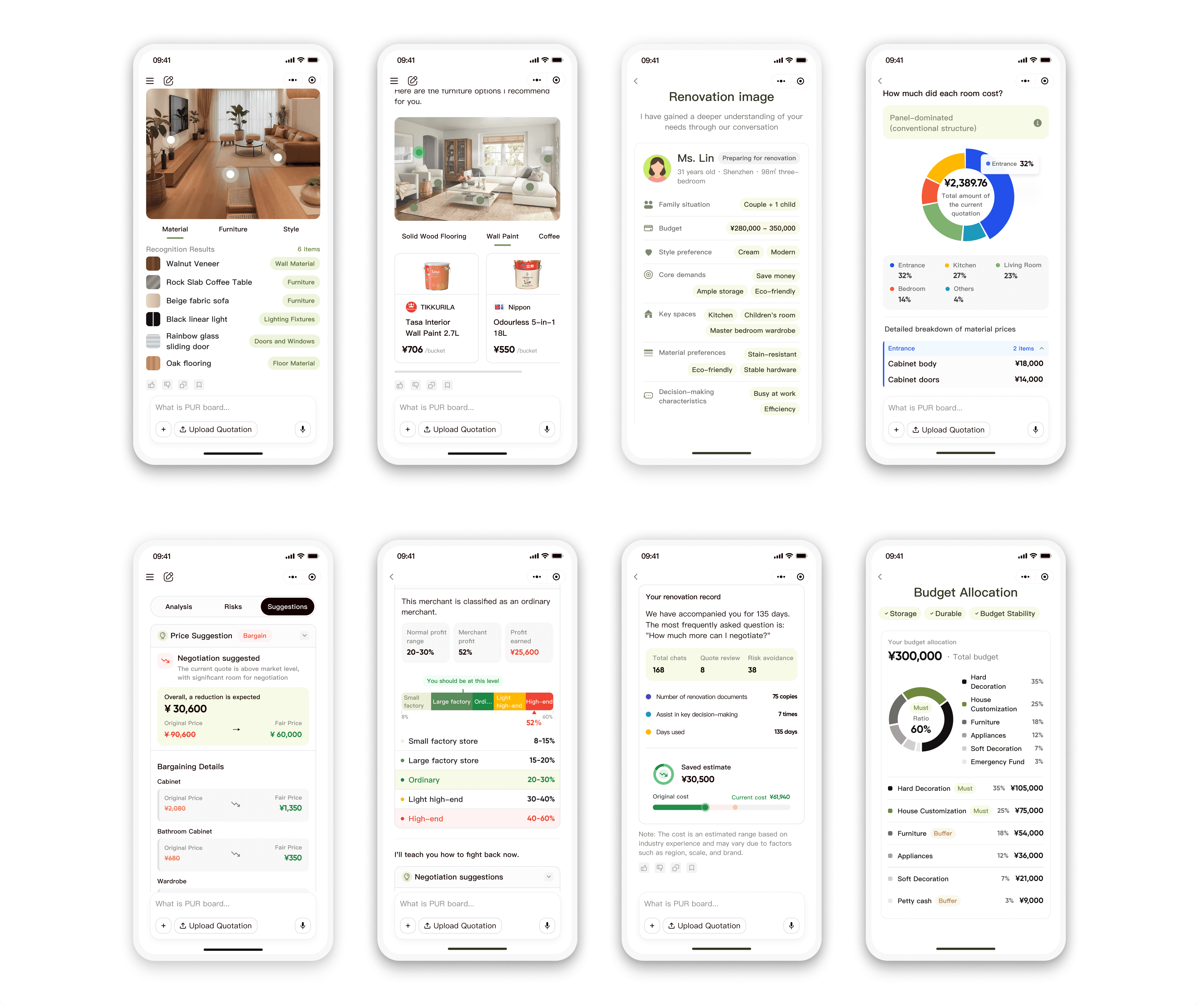
A transparent and step-by-step guided home-customization AI advisor that turns quotes into confident decisions.
AI analysis that shows its work — every step of the way.
A live step-by-step view of the AI's thinking for every stage — during the quotation analysis and during the chat.
An accuracy level indicator lets users catch immediate positive feedback while providing more information, so every extra detail feels rewarding, not interrogative.
A personalized AI Renovation Image builds deeper trust by showing Shellmind truly understands the user's context, style, and needs.

Conclusions first. Evidence when you need it.
Leads every report section with a plain-language verdict users can act on immediately.
Three tabs — Analysis → Risks → Suggestions — each open with a one-line conclusion; supporting data and jargon translations are layered beneath, one tap away for the Detail Auditor, invisible to the Verdict Seeker who trusts the top line.

Don't just read the report — know what to do next.
After every analysis, Shellmind generates a personalized action plan: which line items to push back on, which costs to flag, which contractors to consider, and verbatim negotiation scripts to copy-paste. The report becomes a consultation, not a document to file away — extending product coverage from the verdict all the way through to signing the contract.
PROCESS

How did I get here?
CONTEXT · BETA PRODUCT
The pivot: Renovation decisions in China happen normally in Wechat, not on websites.
We migrated from PC web → WeChat Mini-Program.

THE PROBLEM

Where... do we lose our users?

RESEARCH · QUALITATIVE
From the interview...

STRATEGY · USER FLOW
Homeowners split into two modes

And V1 stopped supporting users before the hardest part of the journey.

CHALLENGES
60% of trial users dropped off
before acting on AI generated insights.
PROBLEM · USER JOURNEY ANALYSIS
So, why were users struggling with the current user journey?
The real journey has 4 stages — V1 left users stranded at every transition.

PROBLEM · USER JOURNEY ANALYSIS
Across the 4 stages, 4 findings emerged — each one became a V2 design move below.

ROOT CAUSE · TRUST ANALYSIS
Looked across all 4 findings — they all point to one underlying gap
Users don't trust the AI enough to act on it.
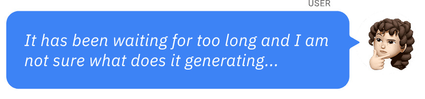
✦ Wait Anxiety is users not trusting the AI is working.
✦ Information Overload is users don't trust the AI to surface the answer at their reading level.
✦ Language Barrier is users not trusting the jargon isn't a sales tactic.
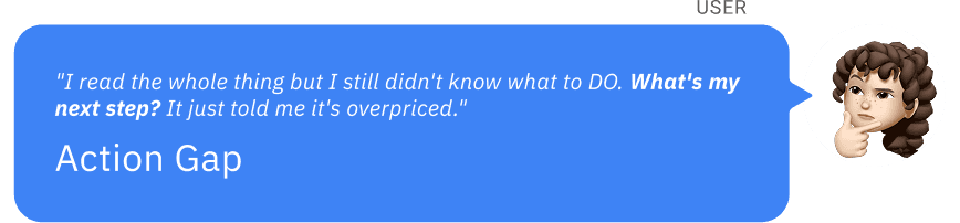
✦ Action Gap is users don't trust the advice is actually executable
(insight without next steps = AI advised but won't help me act).

DESIGN PRINCIPLES FOR AI INTERACTIONS
✦ Each principle has 4 concrete anchors in V2 to specific design moves

DESIGNS

High-level Design Decision
ARCHITECTURE MAP
Where capability meets demand.
Four design moves, decomposed — each rooted at the intersection of what AI can do and what users need.

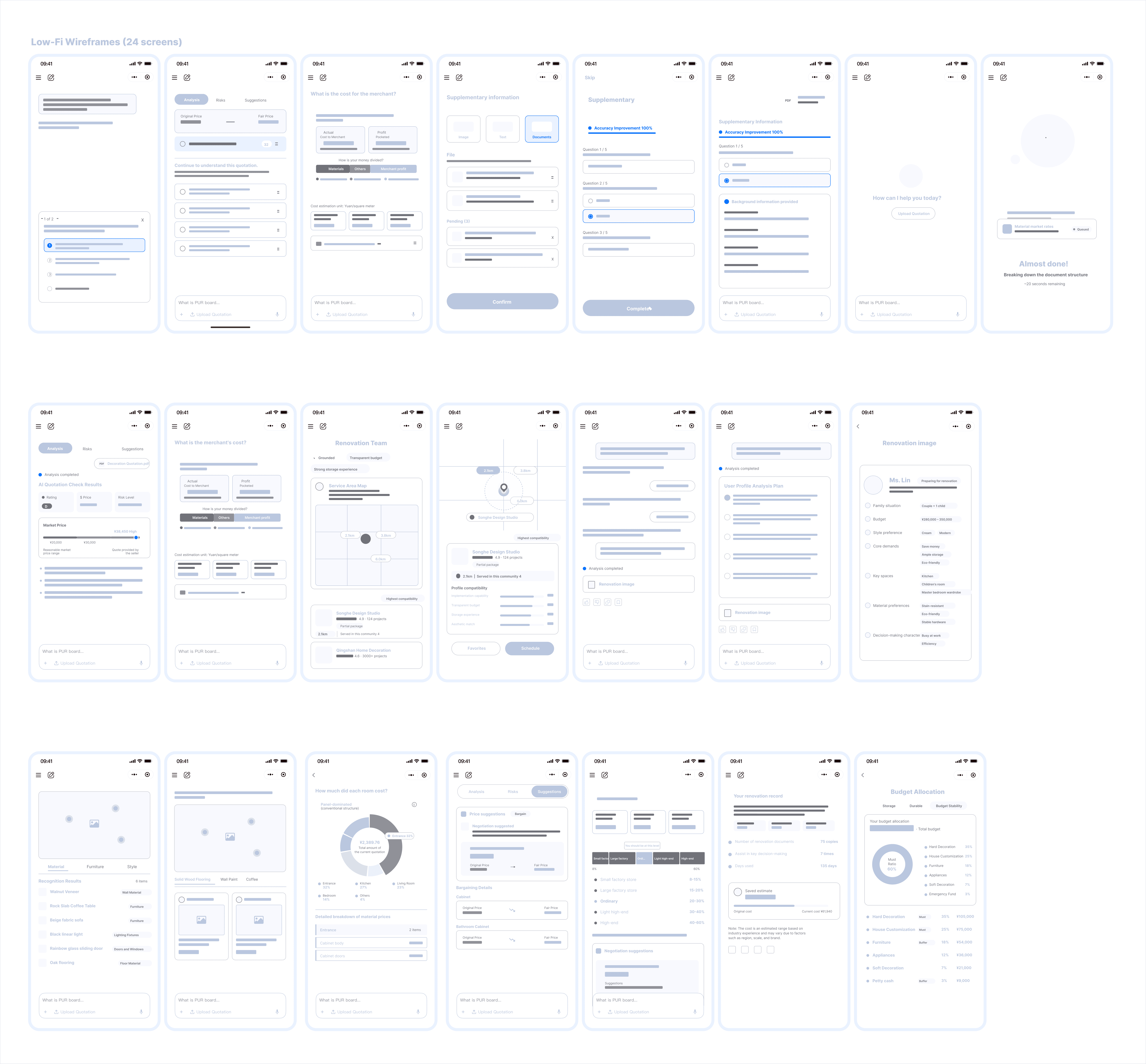
DESIGN LOW-FI
Just an iceberg…
DESIGN DECISION FOR STAGE 1
USER NEED ADDRESSED
User without quote want more guidance on getting started
✦ V1 assumed every user arrived with a quote in hand. The information-gatherers — often the larger pool — had no entry point.

SOLUTION
Re-anchoring the Stage 1 experience:
from a tool page to a conversation with an advisor.
Ⓐ Two entry modes
Ⓑ Intent detection
Ⓒ Accuracy bar


UNRESOLVED PROBLEM
ANALYSIS
I initiated a team discussion and identified 3 ways to turned 30–90s of silent wait into a multi-layered trust moment for users

2A - VISABILITY
Make the wait visible
USER NEED ADDRESSED
User want transparency and reassurance during the wait, even when AI processing takes 30–90 seconds
IDEA EXPLORATION
Based on it, I explored different ideas:
SOLUTION
Make the wait visible - "operational transparency"

2B - AGENCY
Make the wait productive
USER NEED ADDRESSED
User want accuracy and trust in the report, even when their full context isn't captured in the quote

IDEA EXPLORATION
2 Design options generated…
The single-question pattern optimizes for focus; the scroll-form pattern optimizes for control. For a tool where users come to verify a high-stakes judgment, control wins.

SOLUTION
Supplementary information page with scroll-form and accuracy bar
2C - TRUST
Make the wait prove AI understood
USER NEED ADDRESSED
When the AI has no document to react to, it has to prove it understood

SOLUTION
Transforms vague input into visible understanding

UNRESOLVED PROBLEM
USER NEED ADDRESSED
Users want a clear verdict, in plain language, at the depth they choose.
This is where the report has to either earn the user's trust or lose them.

READ REPORT
Where two findings collide with one bimodal reality.
✦ User wants the verdict first, before any data.
✦ User wants plain language first, technical terms second.
✦ User wants depth on demand — 60 seconds or 20 minutes, their choice.


The thesis tying them together:
Stage 3 wasn't about writing a better report — it was about architecting one that could be read three different ways without rewriting it.
INFORMATION ARCHITECTURE REDEFINE
Based on it, I proposed 3-layer progressive disclosure for the report architrecture
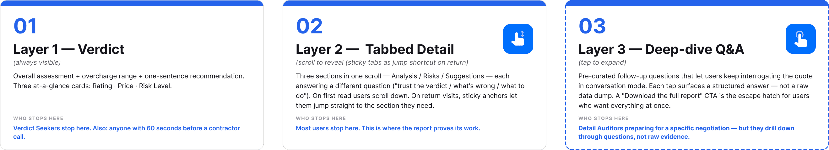
SULUTION
Clear overall verdict on first view


UNRESOLVED PROBLEM
USER NEED ADDRESSED
Users want a move — not just an answer.
Stage 3 ended with understanding. Stage 4 begins where understanding has to become the user's next sentence — with words to say, evidence to defend them, and a Plan B if the conversation falls apart.

TAKE ACTION & REPEAT USAGE
When the report ends, the real question begins.
V1 delivered insights — then abandoned users at the moment of decision. V2 turns the report into a consultation that walks users into their next step.

The thesis tying them together:
REDEFINE USER FLOW
Turned a terminal report into a continuing consultation loop
V1 ends with a download button. V2 ends with the user's next step.


SULUTION
How V2 keeps going, from report to live consultation
Three guided-action surfaces that turn insight into the user's next step.

OTHER IMPROVEMENTS
Other features' improvements


IMPACT
The success rates across all stages improved significantly,
though there is still room for further improvement.


REFLECTIONS
My takeaways
Reframing the Problem Was the Real Design Work
In this project, the most consequential decision I made wasn't visual — it was definitional. The brief I was handed was "make the AI report better." Through user research, I argued the report wasn't one thing to one user — it was four different jobs across four stages, and "better" meant something different at each. That reframe shaped every downstream decision. I learned that the largest leverage in product design often lives in challenging what the problem actually is, not in solving the one you're handed.
Trust Is an Architecture, Not a Feature
Designing for an AI product where users upload a quote and wait blindly for a verdict taught me that trust isn't a layer you add at the end. I structured it as a system — Visibility (let users see the AI work), Control (let users shape the analysis), Agency (let users act on the verdict) — and threaded each pillar into a different stage of the journey. None of those pillars could have been polished in at QA. I learned to treat trust as something you build into the flow, not something you decorate the UI with.
Working with Ambiguity Was the Design Brief
Building a consumer-facing AI tool in the renovation space meant working with three layers of uncertainty at once: an AI whose outputs were probabilistic by nature, a user base that had no language for what they wanted because they'd never seen a tool like this, and a domain where "fair price" had no settled definition. I learned to navigate this by anchoring on what could be made certain — a clear verdict, transparent reasoning, a concrete next step — and by treating ambiguity not as a problem to eliminate, but as a structural condition to design around.
PROBLEM - USER FOCUS

PROBLEM - BUSINESS FOCUS
Free-to-paid conversion stalled below product targets — even as raw signups grew.
SOLUTIONS
A transparent and step-by-step guided home-customization AI advisor that turns quotes into confident decisions.
AI analysis that shows its work — every step of the way.
A live step-by-step view of the AI's thinking for every stage — during the quotation analysis and during the chat.
An accuracy level indicator lets users catch immediate positive feedback while providing more information, so every extra detail feels rewarding, not interrogative.
A personalized AI Renovation Image builds deeper trust by showing Shellmind truly understands the user's context, style, and needs.
Conclusions first. Evidence when you need it.
Leads every report section with a plain-language verdict users can act on immediately.
Three tabs — Analysis → Risks → Suggestions — each open with a one-line conclusion; supporting data and jargon translations are layered beneath, one tap away for the Detail Auditor, invisible to the Verdict Seeker who trusts the top line.
Don't just read the report — know what to do next.
After every analysis, Shellmind generates a personalized action plan: which line items to push back on, which costs to flag, which contractors to consider, and verbatim negotiation scripts to copy-paste. The report becomes a consultation, not a document to file away — extending product coverage from the verdict all the way through to signing the contract.
PROCESS
How did I get here?
CONTEXT · BETA PRODUCT
The pivot: Renovation decisions in China happen normally in Wechat, not on websites.
We migrated from PC web → WeChat Mini-Program.
THE PROBLEM
Where... do we lose our users?
RESEARCH · QUALITATIVE
From the interview...
STRATEGY · USER FLOW
Homeowners split into two modes
And V1 stopped supporting users before the hardest part of the journey.
CHALLENGES
60% of trial users dropped off
before acting on AI generated insights.
PROBLEM · USER JOURNEY ANALYSIS
So, why were users struggling with the current user journey?
The real journey has 4 stages — V1 left users stranded at every transition.
PROBLEM · USER JOURNEY ANALYSIS
Across the 4 stages, 4 findings emerged — each one became a V2 design move below.
ROOT CAUSE · TRUST ANALYSIS
Looked across all 4 findings — they all point to one underlying gap
Users don't trust the AI enough to act on it.
✦ Wait Anxiety is users not trusting the AI is working.
✦ Information Overload is users don't trust the AI to surface the answer at their reading level.
✦ Language Barrier is users not trusting the jargon isn't a sales tactic.
✦ Action Gap is users don't trust the advice is actually executable
(insight without next steps = AI advised but won't help me act).
DESIGN PRINCIPLES FOR AI INTERACTIONS
✦ Each principle has 4 concrete anchors in V2 to specific design moves
DESIGNS
High-level Design Decision
ARCHITECTURE MAP
Where capability meets demand.
Four design moves, decomposed — each rooted at the intersection of what AI can do and what users need.
DESIGN LOW-FI
Just an iceberg…
DESIGN DECISION FOR STAGE 1
USER NEED ADDRESSED
User without quote want more guidance on getting started
✦ V1 assumed every user arrived with a quote in hand. The information-gatherers — often the larger pool — had no entry point.
SOLUTION
Re-anchoring the Stage 1 experience:
from a tool page to a conversation with an advisor.
Ⓐ Two entry modes
Ⓑ Intent detection
Ⓒ Accuracy bar
UNRESOLVED PROBLEM
ANALYSIS
I initiated a team discussion and identified 3 ways to turned 30–90s of silent wait into a multi-layered trust moment for users
2A - VISABILITY
Make the wait visible
USER NEED ADDRESSED
User want transparency and reassurance during the wait, even when AI processing takes 30–90 seconds
IDEA EXPLORATION
Based on it, I explored different ideas:
SOLUTION
Make the wait visible - "operational transparency"
2B - AGENCY
Make the wait productive
USER NEED ADDRESSED
User want accuracy and trust in the report, even when their full context isn't captured in the quote
IDEA EXPLORATION
2 Design options generated…
The single-question pattern optimizes for focus; the scroll-form pattern optimizes for control. For a tool where users come to verify a high-stakes judgment, control wins.
SOLUTION
Supplementary information page with scroll-form and accuracy bar
2C - TRUST
Make the wait prove AI understood
USER NEED ADDRESSED
When the AI has no document to react to, it has to prove it understood
SOLUTION
Transforms vague input into visible understanding
UNRESOLVED PROBLEM
USER NEED ADDRESSED
Users want a clear verdict, in plain language, at the depth they choose.
This is where the report has to either earn the user's trust or lose them.
READ REPORT
Where two findings collide with one bimodal reality.
✦ User wants the verdict first, before any data.
✦ User wants plain language first, technical terms second.
✦ User wants depth on demand — 60 seconds or 20 minutes, their choice.
The thesis tying them together:
Stage 3 wasn't about writing a better report — it was about architecting one that could be read three different ways without rewriting it.
INFORMATION ARCHITECTURE REDEFINE
Based on it, I proposed 3-layer progressive disclosure for the report architrecture
SULUTION
Clear overall verdict on first view
UNRESOLVED PROBLEM
USER NEED ADDRESSED
Users want a move — not just an answer.
Stage 3 ended with understanding. Stage 4 begins where understanding has to become the user's next sentence — with words to say, evidence to defend them, and a Plan B if the conversation falls apart.
TAKE ACTION & REPEAT USAGE
When the report ends, the real question begins.
V1 delivered insights — then abandoned users at the moment of decision. V2 turns the report into a consultation that walks users into their next step.
The thesis tying them together:
REDEFINE USER FLOW
Turned a terminal report into a continuing consultation loop
V1 ends with a download button. V2 ends with the user's next step.
SULUTION
How V2 keeps going, from report to live consultation
Three guided-action surfaces that turn insight into the user's next step.
OTHER IMPROVEMENTS
Other features' improvements
IMPACT
The success rates across all stages improved significantly,
though there is still room for further improvement.
REFLECTIONS
My takeaways
Reframing the Problem Was the Real Design Work
In this project, the most consequential decision I made wasn't visual — it was definitional. The brief I was handed was "make the AI report better." Through user research, I argued the report wasn't one thing to one user — it was four different jobs across four stages, and "better" meant something different at each. That reframe shaped every downstream decision. I learned that the largest leverage in product design often lives in challenging what the problem actually is, not in solving the one you're handed.
Trust Is an Architecture, Not a Feature
Designing for an AI product where users upload a quote and wait blindly for a verdict taught me that trust isn't a layer you add at the end. I structured it as a system — Visibility (let users see the AI work), Control (let users shape the analysis), Agency (let users act on the verdict) — and threaded each pillar into a different stage of the journey. None of those pillars could have been polished in at QA. I learned to treat trust as something you build into the flow, not something you decorate the UI with.
Working with Ambiguity Was the Design Brief
Building a consumer-facing AI tool in the renovation space meant working with three layers of uncertainty at once: an AI whose outputs were probabilistic by nature, a user base that had no language for what they wanted because they'd never seen a tool like this, and a domain where "fair price" had no settled definition. I learned to navigate this by anchoring on what could be made certain — a clear verdict, transparent reasoning, a concrete next step — and by treating ambiguity not as a problem to eliminate, but as a structural condition to design around.